Closing out our assessment tab(s)
We condensed the layout of the assessment pages to improve the amount of vertical screen space! In the previous layout, on smaller screens, the amount of usable real estate was quite low due to tab wrapping and the size of navigational elements.
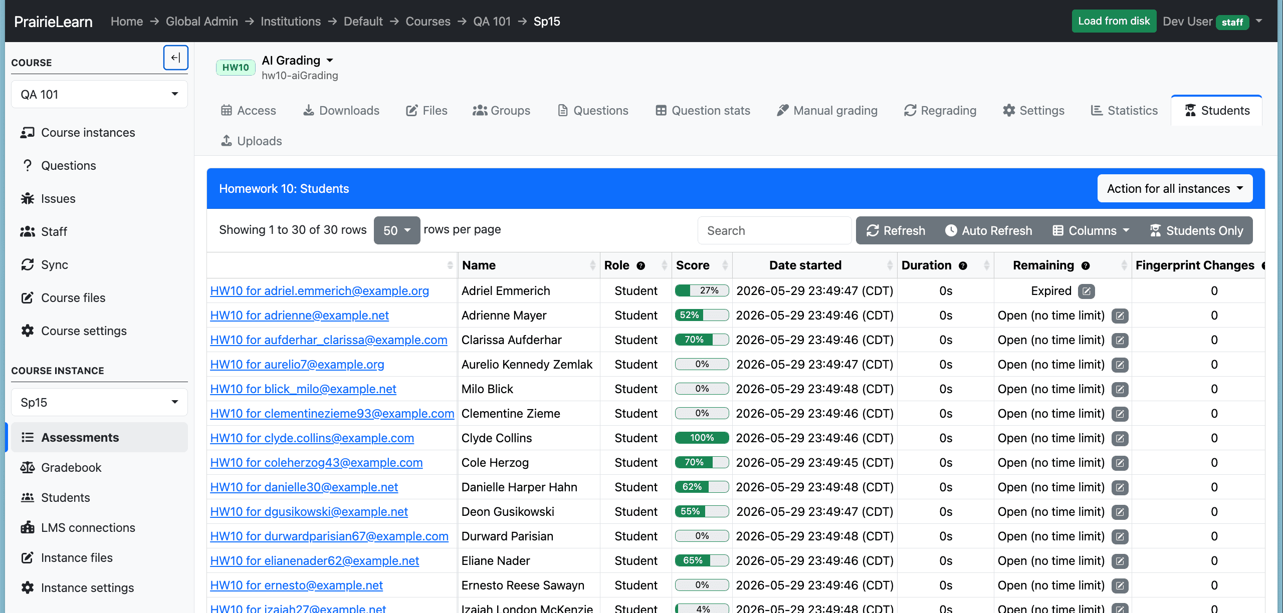
The previous assessment students page with a second row of tabs and minimal space for content
Now there is one row of tabs, merging with the assessment navigation.
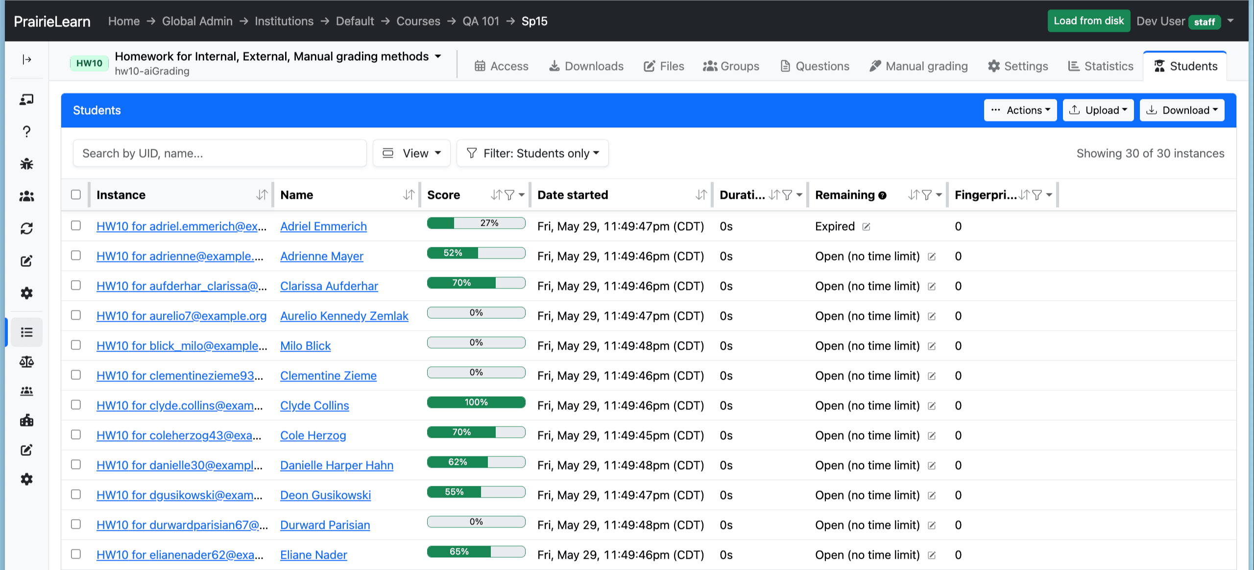
The new assessment students page with more visible rows
Where everything went
The new assessment students page now lets you easily manage your assessment in one place. The Actions menu gathers everything you do to instances in one place: Grade, Grade & close, Regrade, Change time limit, Delete, and View logs. You can choose to apply these actions to selected subsets of students.
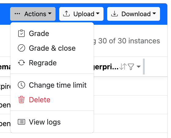
One menu for grading, regrading, time limits, deletes, and logs.
The old "Uploads" tab is now an Upload menu sitting right next to Download, so importing question scores, total scores, and submissions lives next to exporting them.
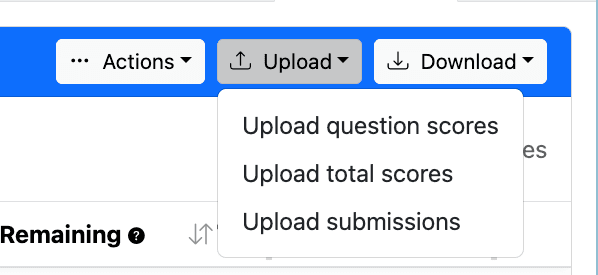
Importing scores and submissions now sits next to Download.
And View logs drops you straight onto the assessment logs, so you can audit grading and regrading runs without digging through settings. Logs can also be found at the bottom of the assessment settings page.
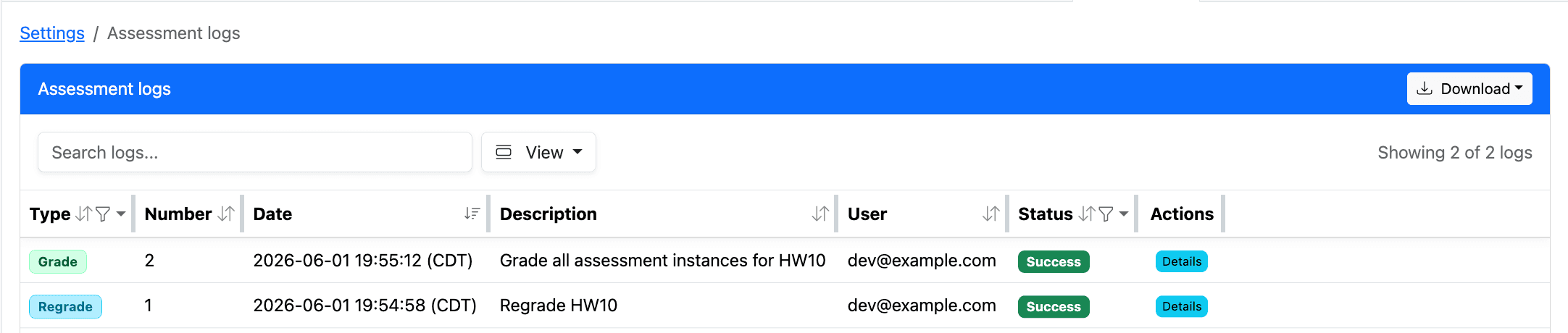
View logs takes you directly to the assessment activity log.
The "Question stats" and "Statistics" pages were merged together.
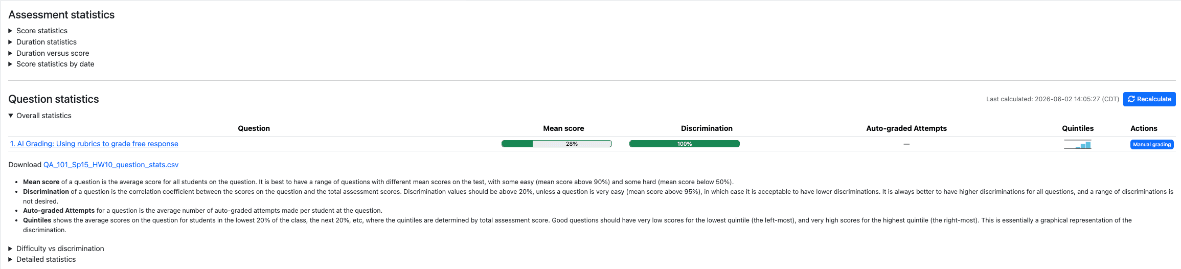
The merged statistics page
We saved some space and closed out a couple of tabs. Best of all, there is no tab to pay: this round of screen real estate is on the house 🍺